
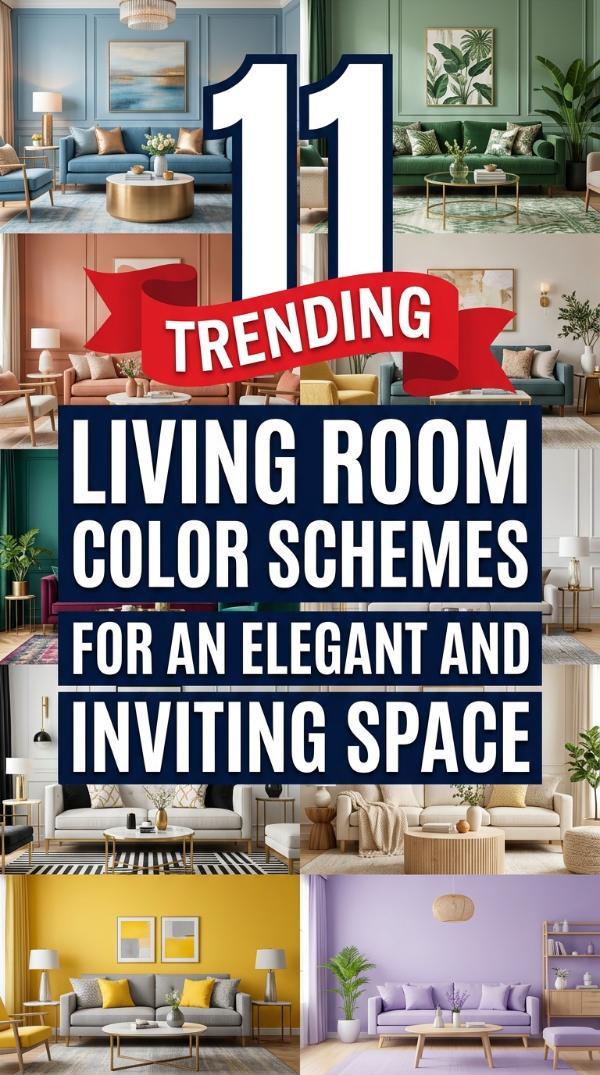
Transforming your home starts with the perfect palette. Choosing 11 Living Room Color Schemes for an Elegant and Inviting Space makes your house feel like a true sanctuary.
Many struggle to balance sophistication with comfort. It is easy to feel overwhelmed by endless swatches and paint samples while trying to design your dream room.
This guide offers curated combinations to elevate your home. Discover how these timeless colors can create a warm, stylish atmosphere for your family and guests.
1. Soft Greige and Charcoal
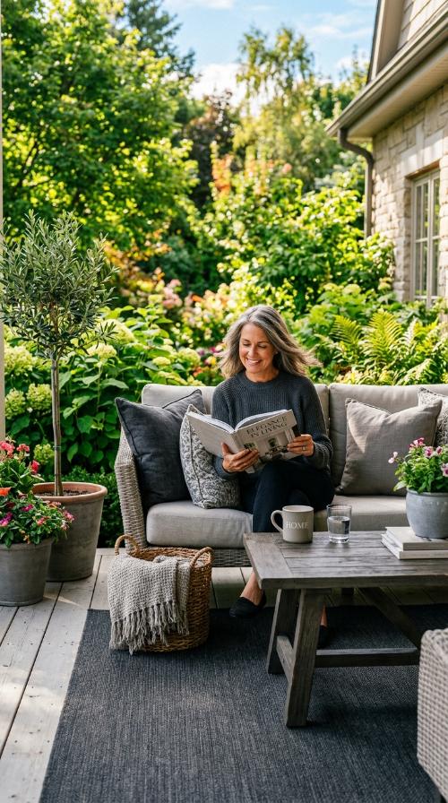
Greige offers the perfect neutral foundation for any modern home. It blends the warmth of beige with the cool sophistication of light grey seamlessly.
Charcoal accents provide deep contrast without feeling too heavy. Use dark pillows or a feature wall to ground the airy feel of the room.
This combination feels incredibly upscale yet very welcoming. It is a foolproof choice for those who love a clean, minimalist aesthetic in their living space.
2. Navy Blue and Gold
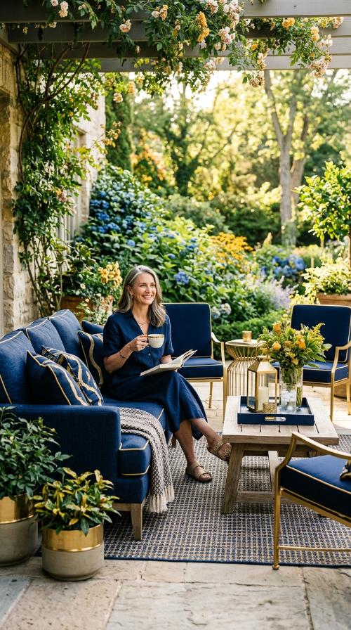
Navy blue brings a sense of regal depth to your walls. It creates a cozy, cocoon-like feeling that instantly makes a large room feel intimate.
Gold accents add the necessary shimmer to brighten the dark tones. Think brass lamps or gold-framed mirrors to catch the afternoon light beautifully.
This pairing is the definition of timeless elegance. It works perfectly for formal entertaining or relaxing after a long day of work with your family.
3. Sage Green and Terracotta
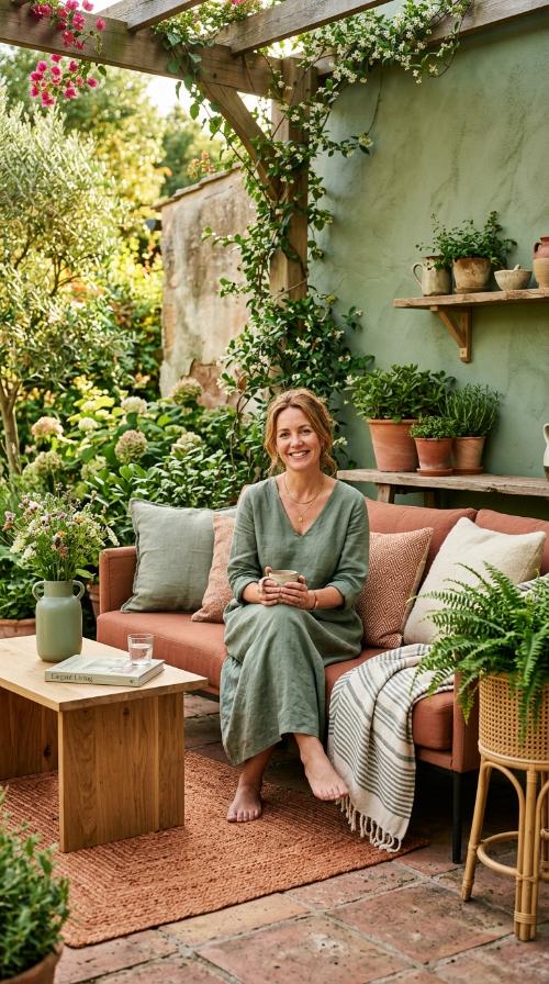
Bring the beauty of the outdoors inside with sage green. This muted earthy tone promotes a sense of calm and wellness in your living area.
Terracotta adds a punch of warmth and organic energy. Use clay pots or rust-colored textiles to create a stunning look that feels alive and vibrant.
It is an inviting scheme that feels grounded and natural. Guests will feel instantly at ease in this soft, botanical environment that celebrates nature.
4. Cream and Warm Wood
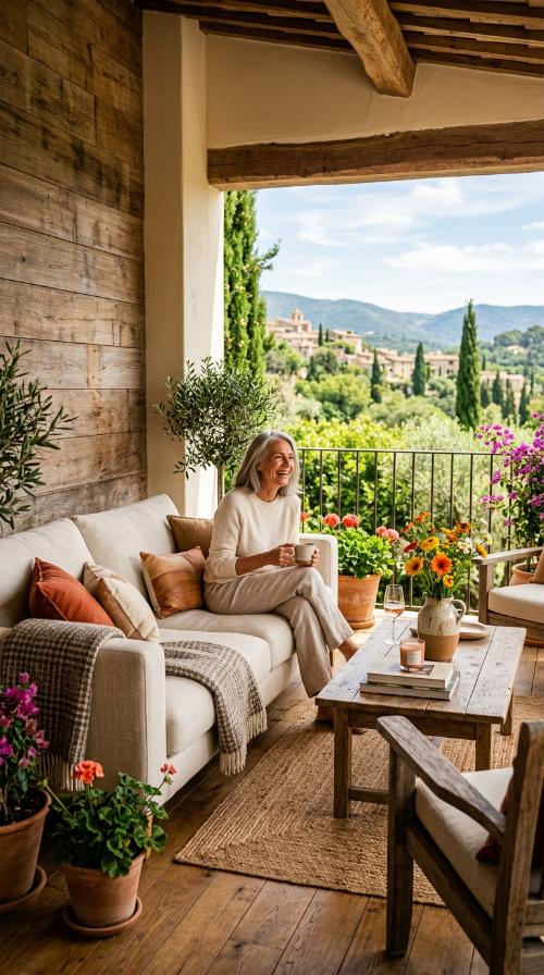
Nothing beats the simplicity of a classic cream palette. It reflects light beautifully, making even the smallest living rooms feel expansive and bright throughout the day.
Natural wood elements prevent the space from feeling clinical or cold. Oak or walnut textures add essential character and a touch of rustic charm to the room.
This look is effortless and incredibly easy to maintain. It provides a blank canvas for you to swap out seasonal decor easily whenever you want a change.
5. Dusty Rose and Slate
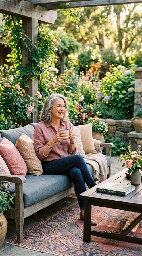
Dusty rose is a sophisticated take on traditional pink tones. It offers a romantic, soft glow that looks stunning under warm evening lighting for a relaxed vibe.
Slate grey provides a masculine edge to balance the floral vibes. This contrast ensures the room feels mature and balanced for everyone in the home to enjoy.
This scheme is modern, chic, and surprisingly versatile. It works well with both vintage furniture and contemporary, sleek design pieces found in modern apartments.
6. Deep Emerald and Mustard
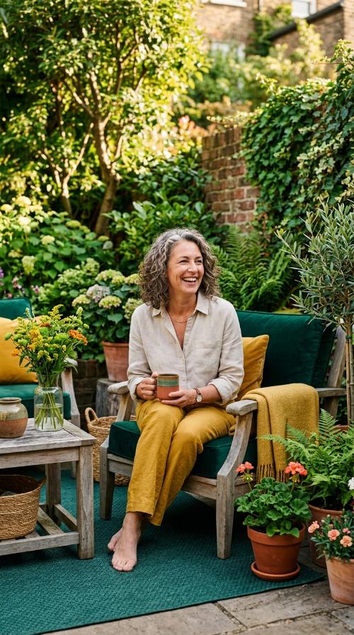
Emerald green is a bold choice for a moody lounge. It exudes luxury and pairs exceptionally well with indoor plants and velvet upholstery for a rich texture.
Mustard yellow pops against the dark green for a retro-chic vibe. This sunny accent keeps the space from feeling too dark or overly formal during the day.
Use this combination to create a high-impact, designer look. It is perfect for those who want their living room to make a bold and memorable statement.
7. Monochrome White and Black
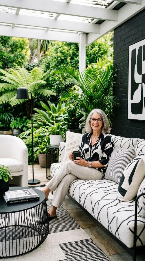
A black and white scheme is the ultimate in high-fashion decor. It creates sharp lines and a dramatic environment that never goes out of style.
Soften the look with plenty of textures like wool rugs. Adding different materials prevents the high-contrast colors from looking too harsh or flat in natural light.
This palette is perfect for showcasing bold artwork or sculptures. It remains a favorite for modern urban lofts and contemporary suburban homes alike.
8. Soft Lavender and Silver
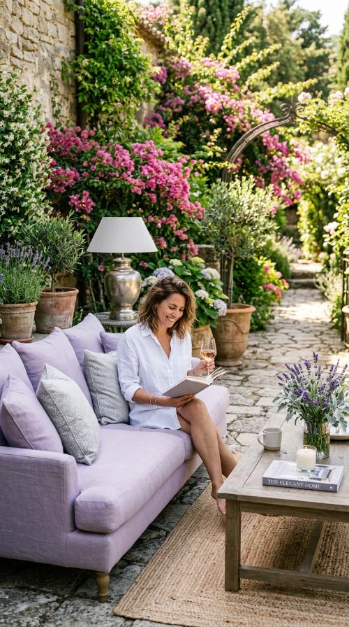
Lavender is a refreshing alternative to standard blue or grey. It adds a whisper of color that is both soothing and very unique for a living area.
Silver accents reflect the purple tones for a cool, crisp finish. Chrome coffee tables or silver silk curtains add a touch of glamour to the overall design.
This scheme feels light, airy, and delicately feminine. It is a wonderful choice for creating a tranquil space to read and reflect in peace.
9. Teal and Burnt Orange
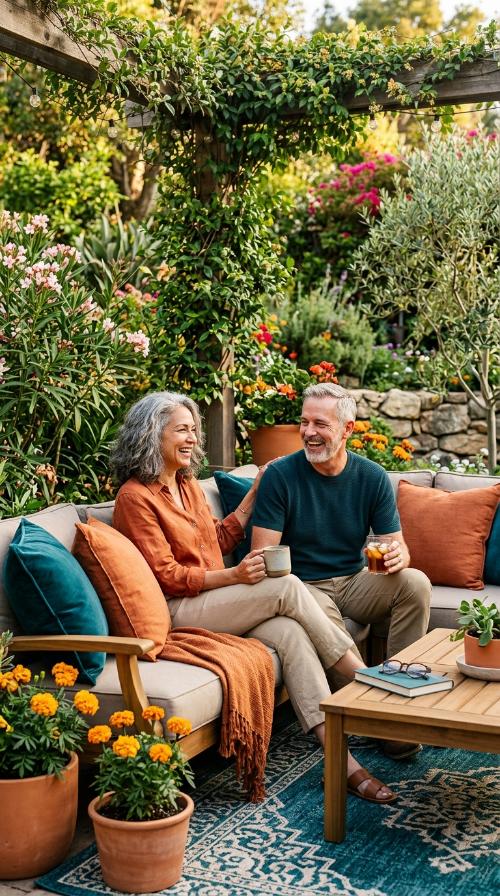
Teal is a rich, saturated color that feels expensive. It bridges the gap between blue and green, offering a complex and interesting backdrop for your furniture.
Burnt orange serves as the perfect complementary color for excitement. These warm tones spark conversation and add a vibrant energy to the room during social gatherings.
This palette is adventurous yet surprisingly cozy for families. It works best in rooms with plenty of natural sunlight to show off the deep pigment.
10. Sandy Beige and Sky Blue
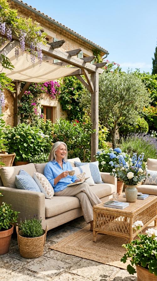
Channel the serenity of the coast with beige and blue. These colors mimic the sand and sea for a permanent vacation feeling right in your own home.
Sky blue accents provide a breath of fresh air. Use light blue pillows or curtains to keep the neutral beige base from looking dull or dated.
It is a classic combination that feels bright and optimistic. This scheme is ideal for creating a relaxed, coastal-inspired gathering place for your loved ones.
11. Plum and Champagne
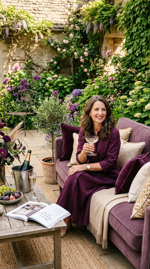
Plum is a regal, deep purple that adds instant drama. It feels cozy and sophisticated, perfect for long evenings of relaxation or hosting elegant dinner parties.
Champagne gold or beige lightens the mood with a soft shimmer. This combination feels like a luxury hotel suite brought into your own residence.
It is an elegant choice for those who love rich colors. This palette ensures your living room feels expensive and carefully curated for a high-end finish.
Which color makes a room look larger?
Light shades like cream or soft white reflect more light. This trick makes your walls appear further apart and opens up the entire space visually.
Can I use dark colors in small rooms?
Yes, dark colors create a cozy, library-like atmosphere. They can actually hide the corners of a room, making the boundaries feel less defined and more mysterious.
How do I choose an accent color?
Look at the opposite side of the color wheel. A complementary shade will pop against your main color and create visual interest for your guests immediately.
Are neutral colors still popular this year?
Absolutely, neutrals provide a timeless foundation for any home. They allow you to update your style with small accessories without repainting every single season.
How many colors should I use?
Stick to the 60-30-10 rule for the best results. Use a dominant color, a secondary shade, and one bold accent for a perfect visual balance.
Does lighting affect my paint choice?
Lighting changes how colors appear throughout the day. Always test your paint swatches in both natural daylight and artificial evening light before making a final decision.